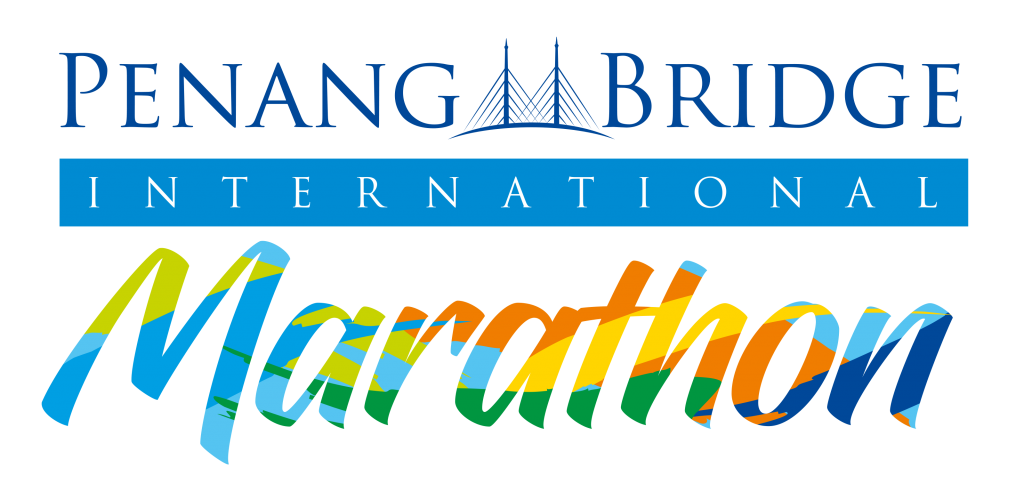
RATIONALE FOR NEW LOGO
- Refreshed, simple and clear for a powerful message to visualise energy
- The primarily blue composition symbolises the water element, where Penang is poised strategically at the Strait of Malacca. By highlighting the use of waves, it is a symbolic representation of PBIM as one of the unique marathons on bridge run over water.
- The vibrant colours of the ‘marathon’ also mirrors Penang’s identity as a destination for the sea, sun, nature and culture – bringing about a splash of colours for Penang’s unique and vibrant mix of cultures and diversity.
- The facelift is a change accompanied by the evolving branding and identity of PBIM to bring about a special focus and attention to the logo which portrays PBIM’s identity as an international sporting event while celebrating the diverse background of the participants.